|
Article ID: 2287
Last updated: 11 Apr, 2022
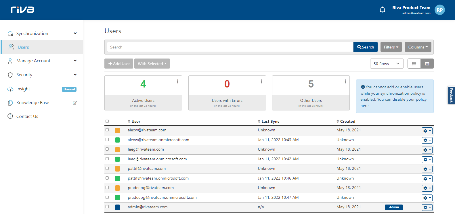
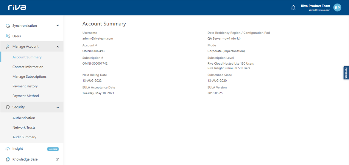
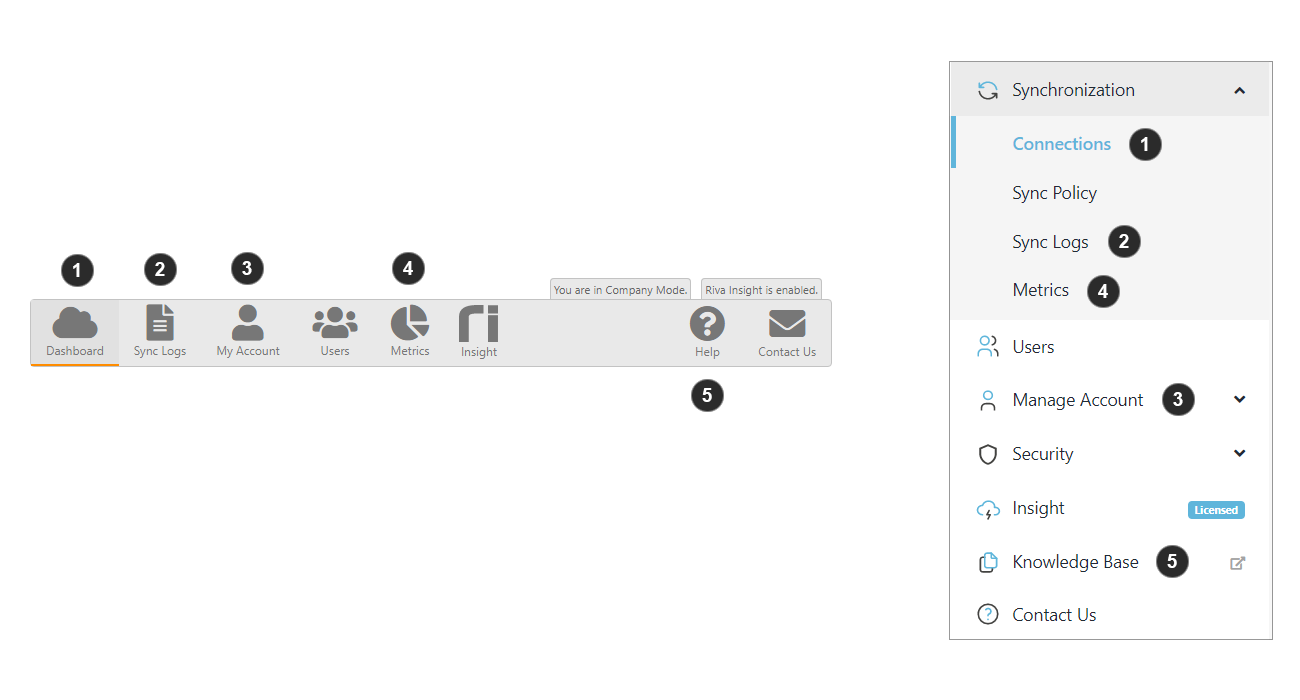
Cloud has a new look!In the 2022.1 version release (Jan. 18) of Riva Cloud, we have improved the user experience of the Riva Cloud website by consolidating all the menu options into the left navigation bar and improving the overall appearance of the navigation. This is a change from our previous top-down menu bar, which we will outline the latest changes below. New Updates: UI ChangesPreviously in Cloud versions before 2022.1, the navigation had a top-down design with certain menu options only accessible through another page. In the new design, we have a side navigation that will display all of the available menu selection in one place. The menu options shown are clickable and will navigate the user to a new page. Certain menu options displaying a downward arrow will provide a dropdown of more options to access.
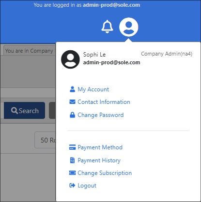
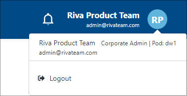
Before Cloud 2022.1 - Old Navigation Design Cloud 2022.1 - New Navigation Design Profile Navigation ChangesThe profile icon, bell icon and the navigation have a more condensed and refined appearance. The profile navigation will have the same user behaviour by displaying the impersonation mode. The changes that were made:
Before Cloud 2022.1 - Old Profile Navigation
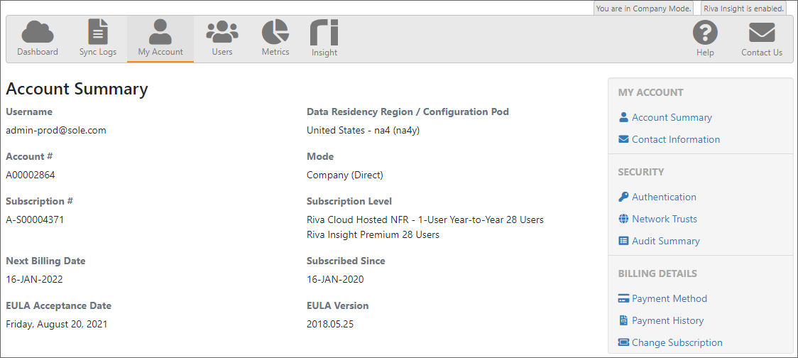
Cloud 2022.1 - New Profile Navigation Account Menu ChangesThe sub-menu options for My Account, Security and Billing Details was previously only accessible when a user navigated to the My Account page. The options are now accessible from the main side navigation under Manage Account and Security.
Before Cloud 2022.1 - Old Account Sub-Menu
Cloud 2022.1 - Account in Main Navigation Categories and Label ChangesThere are a few differences between the old navigation and the new navigation:
Article ID: 2287
Last updated: 11 Apr, 2022
Revision: 33
Views: 0
|

